Interactive World Happiness Dashboard


Share

Are you in one of the happiest countries in the world? The World Happiness Report provides the answer to this question. It’s a publication that contains analysis and rankings of national happiness based on respondents’ ratings of their own lives. Results and findings are freely available so that you can compare various measures that contribute to happiness.
View Dashboard in New Tab
Finding the true meaning of this data is difficult (and let’s be honest, scrolling through tables of data is kind of boring). Generally, people are better at understanding information when it’s presented visually. It’s hard to derive any meaning from a table of thousands of rows of numbers — but graphs, charts, and maps can convey a lot of information at a glance.
To demonstrate our data skills, we built an interactive and dynamic dashboard that lets you compare the happiness factors as you perceive them in your life and shows you easy-to-read results instantly based on your input. Our dashboard aims to make it easy to compare happiness across countries and regions and provide insight into the factors that come into play when comparing world happiness.
So, if you’re looking to spur change, are curious about data, or just want to win an internet argument, keep reading to learn more about the World Happiness Report and play with our dashboard.
What is the World Happiness Report?
The World Happiness Report results from global surveys asking participants to assess the quality of their own lives. This data is processed into a single ranked dataset that correlates factors affecting the quality of life and national progress to happiness.
Why is it important to measure happiness?
It comes as no shock that those living in poverty or living in countries experiencing political turmoil are less happy than those living in relatively wealthy, politically stable countries. However, there are some surprises to be found in the results of the World Happiness Report — just living in a rich and powerful nation is not enough to guarantee a happy life.
While the report is far from perfect, it provides the data you need to understand how people in other regions with differing wealth and freedoms perceive their own quality of life compared to how you perceive your own.
Humans, as individuals, find their own ways to achieve comfort and happiness, even in the most adverse situations. This applies collectively, too — people work together as friends, families, neighborhoods, and societies to improve their lives. Measuring the overall happiness of a group can identify the biggest contributing factors that positively and negatively affect happiness. These factors can then be targeted to improve the lives of those who are suffering by addressing the causes, be it economic adversity, lack of access to healthcare, or limited opportunities for the future.
Identifying what can be done to improve people’s lives makes measuring happiness important. Additionally, sustainable happiness leads to outcomes that, in turn, further improve the quality of life for the individual and the group:
- Health and longevity: Statistics show that happy people are healthier and live longer — and that healthy people are happier.
- Less mental health problems and less stress: Quality of life reduces the occurrence of depression, anxiety, and other mental health issues.
- Increased productivity: People satisfied with their lives will contribute more at work.
- Better social relationships: Happy people are more supportive of their friends and family and less likely to get divorced.
- Good citizens: People who are comfortable with their lives tend to donate more, volunteer more and help others in the community.
Happy people make happy people. Healthy, productive people in good relationships can bounce back from adversity with the support of their community and will in turn help others who need it.
Why did we choose the World Happiness Report for our dashboard?
The World Happiness Report is a well-documented research program carried out annually over the past decade (this year, it marks its tenth anniversary!). The statistical data used in the report is collected from the public and is mostly open source, meaning it’s readily available for other parties (like us) to analyze and study independently.
The data is well organized, and while the concepts behind it are easy to understand, there is a lot of data, making it somewhat inaccessible to the public. There are multiple metrics across hundreds of countries, making comparison difficult without a dedicated effort and familiarity with data processing tools.
Some popular online surveys help you measure your happiness index compared to others by making you fill out a survey yourself, only showing you your results and comparison on completion. While informative, it’s not the most convenient way to interact with this kind of data — every time you want to make an adjustment to your input, you must retake the survey. Repeated comparisons and experimentation with the data become tedious.
This makes the World Happiness Report an ideal data source for our own comparison tool — we can take this unwieldy data set and make it easy to consume for the public. It’s a functional and interesting demonstration of our data skills that we can share with our friends and colleagues — and you! Not to mention that our dashboard is scalable, so we can add new data from the yearly World Happiness Report as it is made available each year, keeping our results fresh and accurate.
What data is available in the World Happiness Report?
The data provided by people surveyed in the report is based on the Cantril ladder survey. Respondents are asked to rank their lives on a scale from 1 to 10, with 10 being the ideal life and 1 being the worst possible existence as the respondent imagines it. The final rankings are determined by these survey results. Further insights into why some places are happier are given by six factors that are assessed by the World Happiness Report to be the biggest contributors to the respondents’ answers.
The six contributing factors identified by the World Happiness Report are:
- GDP per capita: The monetary metric that indicates a country’s economic performance per person — often used as a measure of living standards.
- Life expectancy: The average age a person is expected to live to — an indicator of the general health of a population.
- Generosity: Measured by surveying people on whether they have donated money to a charity in the last month.
- Social support: Whether respondents feel that they are adequately cared for and supported by their community.
- Freedom: Measured by the respondents’ perceived level of autonomy to act on their own decisions.
- Corruption: Similarly, measured by the respondents’ perception that those acting in an official capacity are illegitimately leveraging their position for personal gain.
These factors are not presented as the only variables that can affect happiness but are used because the same or comparable information is available for all countries. Some of these factors also cover several contributing elements and can be used as a general measure where less granular data is available (for example, while unemployment data is not available internationally, GDP is highly correlated).
Typically, 1000 people from each country are surveyed each year. Responses from the past three years are used to provide a current but stable representation of citizens’ self-evaluated quality of life. Unfortunately, not all countries are surveyed annually, but a sample size of at least 2000 people over three years is large enough to provide insights at a national level, giving a 95% confidence interval.
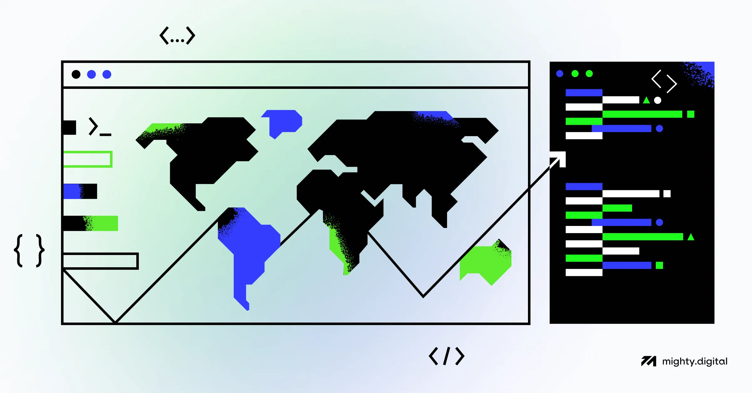
Our Interactive Dashboard makes this data easily consumable by showcasing it through trendlines and maps. It provides you with an immediately understandable overview of the data presented in the World Happiness Report — without making you take a deep dive into the raw numbers. Our dashboard allows for additional insights and specific comparisons for those who are interested in the individual factors while remaining accessible for the general public who just want to look at the broader comparisons.
Compare happiness with our interactive dashboard
Food for thought
Once you’ve found out your own happiness score and played around with our dashboard, you can try to answer some of the following questions. If you’re looking for a deeper answer, you can also reference the links attached.
- How did the happiness index change worldwide in the last 10 years?
- Is there a general trend of happiness since the development of social media?
- Did COVID-19 influence happiness in any way?
- Do some factors/parameters have a stronger correlation with happiness than others?
How we built our Interactive World Happiness Dashboard
We put a lot of thought into our dashboard — from deciding on our data source and which data to use to figuring out a fun and informative format for the data and finally working with our favorite tools to put everything together.
Below, we’ve included some notes on how we went about all of this. If you’re interested in data and maybe even want to try building your own interactive dashboards, read on!
Working with the available data
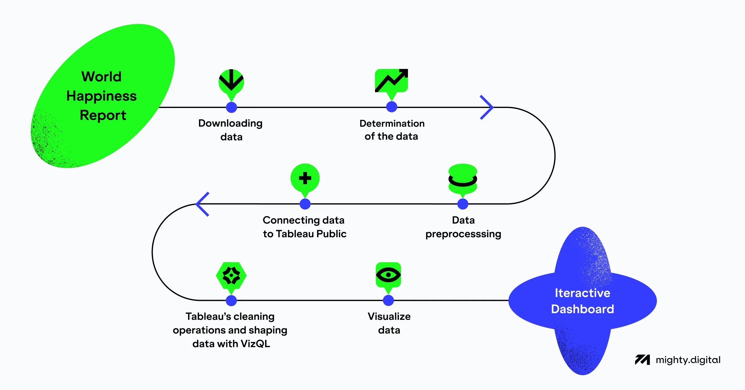
The first step to building our dashboard was to identify the data we required. In this case, all of it was provided by the World Happiness Report. Conveniently, they provide all of their data for their current and historical annual reports.
Downloading the raw data for each year individually is not the most efficient way to gather information, so we utilized this Kaggle dataset that includes all data from 2015 to 2022. Our final dataset includes eight years of data for approximately 150 countries and the six factors that affect the happiness ladder score presented by the World Happiness Report.
Before this data can be used to feed the dashboard, it must be processed to ensure that is suitable for our purposes:
- The data must be clean: spelling and formatting discrepancies must be resolved (such as spelling differences for country names).
- The data must be consistent: missing data (such as when a country did not participate in the survey every year) must be dealt with somehow.
There are no standard ways to deal with these issues because all data is different. Some data problems will have a negligible effect on the results when used for one purpose but detrimental effects when used for another. In our case, we either imputed the missing data or omitted it altogether.
The software used to build the dashboard
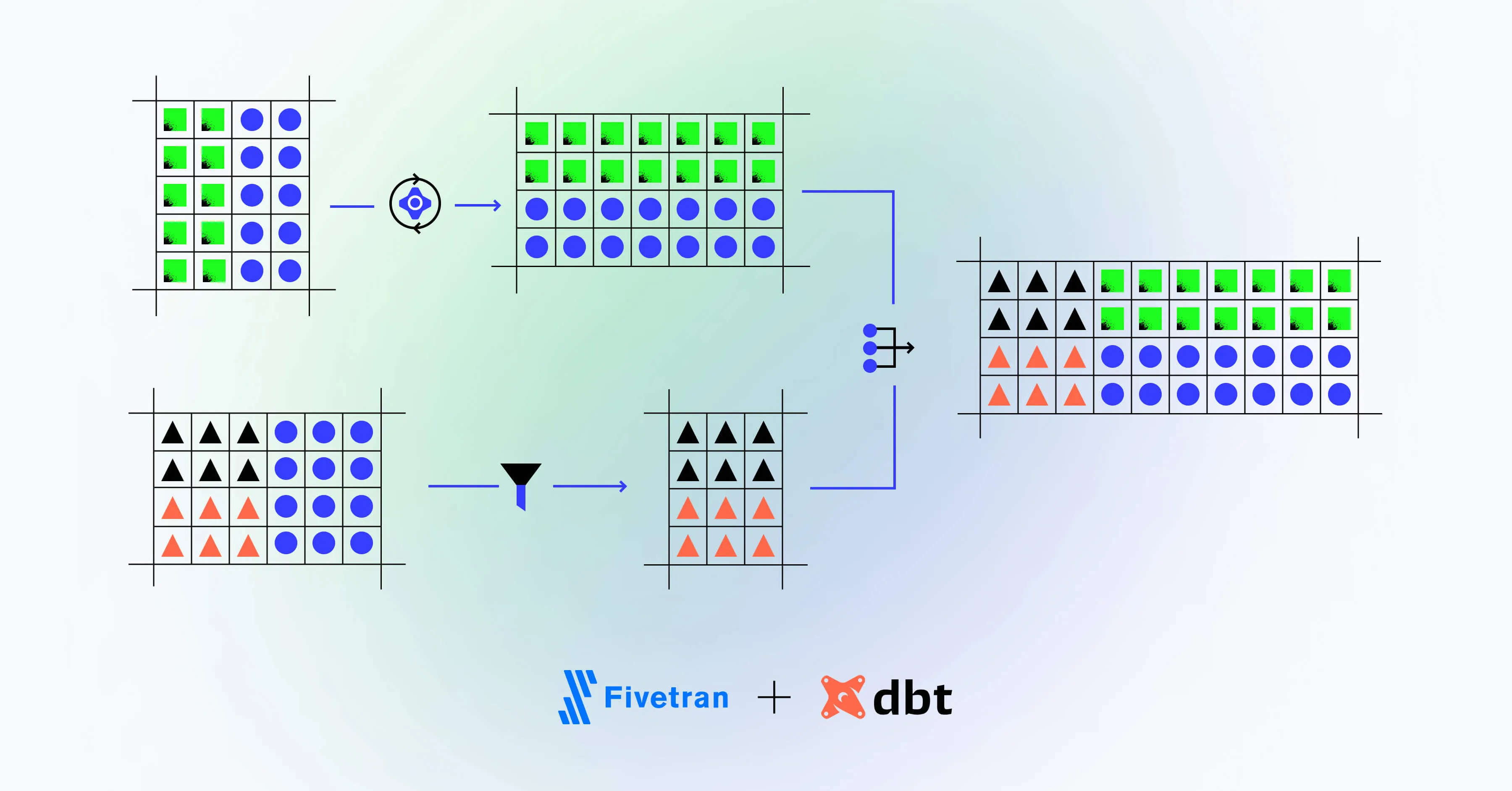
To fix these data issues, we can use something as simple as Microsoft Excel and its Power Query functionality or other tools like Tableau’s cleaning operations to massage the data into a state fit for our use. There are also legitimately good open-source alternatives if you want to avoid commercial software.
If we were collecting our own data, we would consume the data and transform or clean it through an appropriate pipeline and store it for later analysis in a data lake or data warehousing solution.
The interactive dashboard itself is built using Tableau Public, a free and versatile data visualization tool. Once our tidied data was connected to Tableau Public, we did a final check of the data, brushed it up with VizQL, and let our imaginations run wild. We experimented with different charts, maps, and graphs to see what worked best to reveal the story told in the World Happiness Report data.
Once we’d identified the best ways to visualize our data, all that was left to do was polish up the interface and embed the dashboard on this page (if you missed it, scroll up).
Et voilà, we are amazing!
We’re Mighty Digital, and we love data
Data isn’t just a table or a list of numbers. When properly presented and understood, data tells a story about the people it was collected from — in this case, how happy they are. In other cases, it may tell you what a customer is thinking about buying or how much they are enjoying your app or service.
We built this interactive dashboard using the same tools we use daily to serve big data in a readily understandable format to companies across the globe. Our insights power growing businesses who have been realizing and leveraging the value of the existing data they own and new data that they are able to collect.
At Mighty Digital, we live and breathe data, identifying new ways to collect, process, and apply information to better understand the world we are living in. Contact us to find out more about what we do and how we can help you come up with the best growth strategy for your business.